 Arms of Paul's Restaurants Ltd.
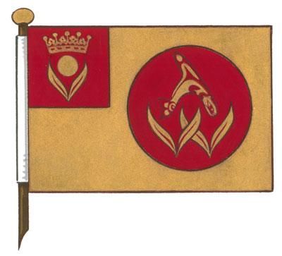
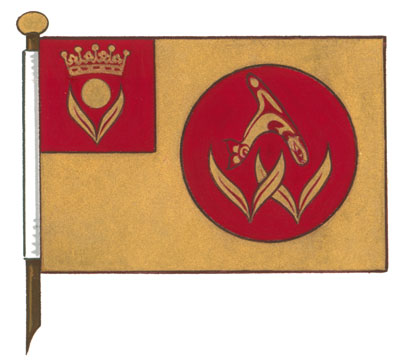
Arms of Paul's Restaurants Ltd.
Blazon
Gules a bezant between in chief an earl’s coronet and in base two laurel leaves conjoined at the base Or;
Symbolism
The disc and laurel leaves represent Laurel Point, the location of the company’s renowned Inn in Victoria. The earl’s coronet alludes to the stylized coronet symbol in current use, and historically, to the name “Sussex Café,” the first name of the company. The Earl of Sussex was a historic English title.
Crest of Paul's Restaurants Ltd.
Blazon
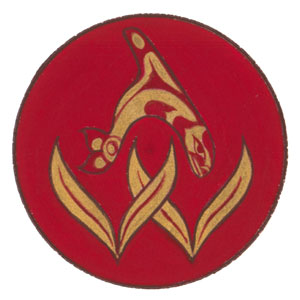
A man sejant affronty on a bench, his dexter hand grasping a staff ensigned by an orca contourné embowed, his sinister hand raised, all Or embellished Gules and in the Kwakwaka’wakw First Nation style;
Symbolism
This represents the idea of a potlatch. The chief is welcoming those to whom he intends to distribute gifts, and the design symbolizes a place that welcomes people.
Motto of Paul's Restaurants Ltd.
Blazon
CURIOSITY • RESPECT • EXCELLENCE • STEWARDSHIP;
Symbolism
CURIOSITY • RESPECT • EXCELLENCE • STEWARDSHIP; are the core values of the company.
Supporters of Paul's Restaurants Ltd.
Blazon
Two delgryphi Or embellished Gules and in the Kwakwaka’wakw First Nation style, issuant from barry crested Argent and Azure on either side of a rocky outcrop proper;
Symbolism
Each supporter is a delgryphus, a combination of griffin (eagle and lion) with a tail of a member of the family delphinidae, in this case an orca’s tail. Styled by Tony Hunt, Chief Naquapenkim, Hereditary Chief of the Kwakwaka'wakw Nation, these creatures represent the ways that guests at the Inn at Laurel Point can arrive at the location at Victoria’s Inner Harbour. The rock and waves represent the promontory on which the Inn sits. The colours of the waves also allude to the Greek ancestry of Paul Arsen, the original owner.